Tagbox
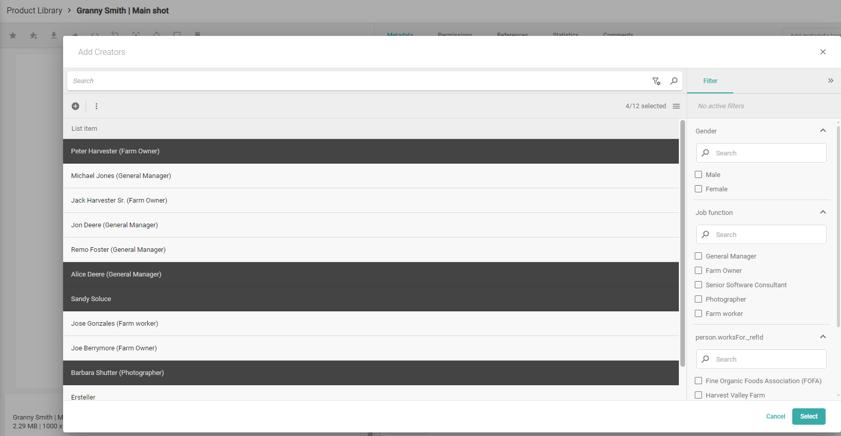
The Tagbox field allows you to tag content, similar to tagging in social media, but with the option to configure the available tags. Tags work as a grouping of content. Tags are structured information because users cannot make typos when selecting from a predefined list. You can use Tags for regions, locations, moods, colors, product categories, countries, and almost everything. You can click directly in a tagbox field to display a drop-down list of suggestions, or, you can select this icon ![]() to open a dialog where you can bulk select several list items. You can also search, filter, sort, and create new list items in this dialog.
to open a dialog where you can bulk select several list items. You can also search, filter, sort, and create new list items in this dialog.
Tagbox Overview
Icon |  |
Behavior | There are two ways to enter data in this field:

The List Display Pattern of the connected list is used for suggestions. Please ensure that the display pattern is adapted for correct suggestions. |
Main benefit | Tags are specific, they support searching with a lot of additional attributes, and are easy to maintain. You can add attributes to the tags anytime, which extends the metadata for all tagged Content Items. You can translate only your tags and find your Content Items in all translated languages. Tagboxes also support the user when adding metadata by showing suggestions, and the user cannot add wrong spelled product names or person names, so the metadata values are already "validated." By not allowing the creation of new List Items, users must work with approved terms only, and your metadata is safe. Note: Permission to create new List Items: "Manage items" in the Schema Permission Set applied to the List. Support for circular references allows for creating extended schemas. |
Connected List | You can create a tagbox without having the List created. When choosing your connected List you can create one. |
Custom vs. System Lists | System Lists are already available in the system used in various places. You cannot change them or their values.
Custom lists are lists you create for your purposes, like keywords, products, or events. |
List Items | The List contains List Items, which have various attributes. The List Item can have a name only or a name, description, and further useful information. When you connect the List to a Tagbox, the List Items become tags added to the Content Item, also known as "tagging." |
View mode | In view mode, the display of tags comes from the Name Display Pattern of the List, connected to the Tagbox field. |
Edit mode | In edit mode:
|
Filters | You can add a tagbox as a filter, using it as facet in the sidebar or for suggestions. In the filter editor you select the tagbox._refid value as filter field, then you add a text field, for example, tagbox.name. as search field. This way the tags are shown with a name. When a user selects a tag the ID is used to find the assigned Content Items, which is more accurate. |
Suggestions in the Tagbox | When you click into the Tagbox Field, you get suggestions from the connected List. You can continue typing to narrow down the suggestions until you find the tag you are looking for. The suggestions consider the filter defined in the Tagbox Settings. The Display Pattern List of the connected list is used for suggestions. Please ensure that the display pattern is adapted for correct suggestions. With appropriate permissions, you can add new List Items while editing your Content Item.
|
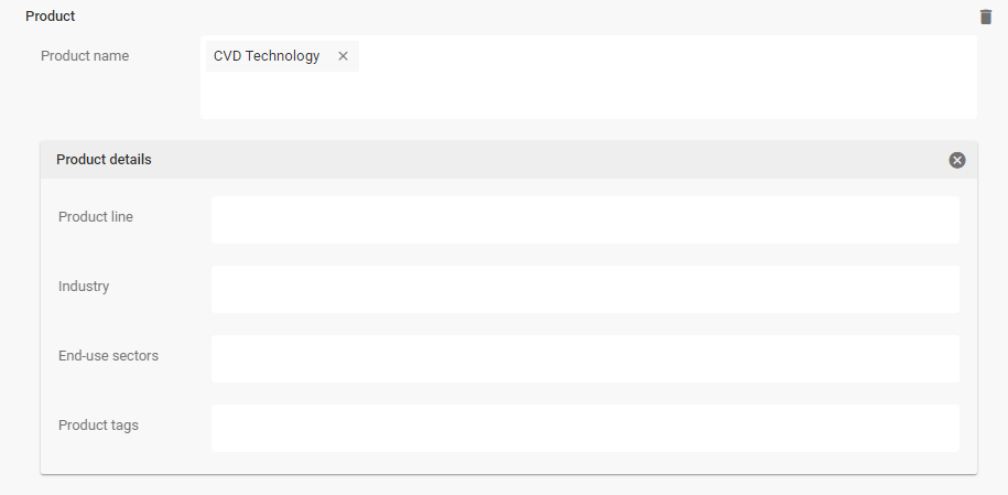
Contextual information (card) | The assigned tags in view mode appear as clickable links. When you click the tag, you see a card with further attributes of the List Item. The card display consists of:
|
Examples |
|
Tagbox Value Handling
Picturepark Setup Example | Layer: Corporate Information (ID: CorporateInformation) |
Fieldpath | corporateInformation.persons |
Usage in Excel | LAYER.TAGBOX-FIELD.CONNECTED-LIST-FIELD |
Tagbox in Fieldset in Business Rules | Entering a list item into a tagbox inside a fieldset requires to first initialize the fieldset, then add the value:
 |
Advanced search for field | _exists_:corporateInformation.persons
|
Advanced search for the field value | |
Use in Display Pattern | |
Unique Identifier | _refId |
Returned field value | Single:
|
Tagbox Field Settings
Name | For single Tagboxes, use the singular for name, for example, department. |
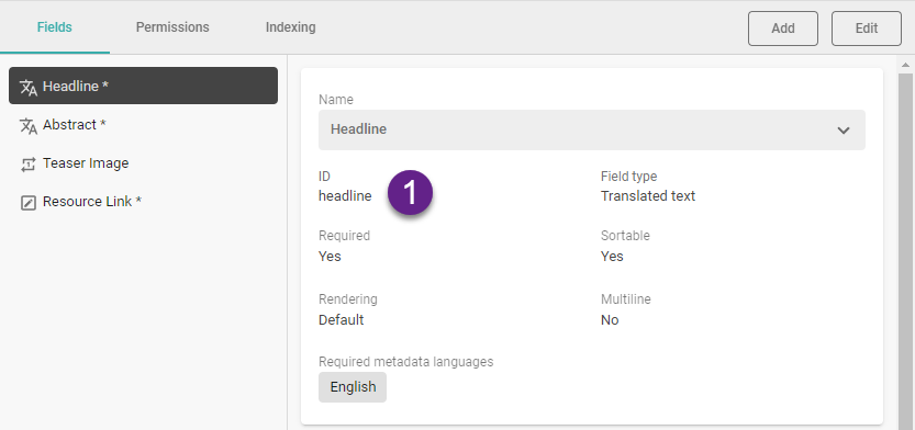
ID | The ID field is the ID of your field, which is used to link to this field. The field ID is always lowercase. The field's ID is set when creating a new field using camel casing. You need the field ID for the configuration of filters or display patterns. The ID is automatically created from the name you insert:
 You can open the Display Pattern Editor to see the JSON of a Content Item. |
Single item tagbox | Allow one or multiple tags. Once set and saved, this value cannot be changed later. Use a single-item tag box when you want to ensure that only one tag is sufficient, such as for either-or questions, for example, state (active, passive). |
Connected List | This List contains the List Items used as tags within the Tagbox field. You can create a tagbox without having the List created. When choosing your connected List you can create one. |
Item filter | Limit the List Items available for selection by using a filter, for example, show only actual products or employees from the board of management. |
Minimum | Only whole numbers (integers) are supported. Adding a minimum value sets the field required. |
Maximum | Setting the maximum value to 1 turns a multi-item tagbox to a single item tagbox; however, we recommend choosing a single item tagbox instead. |
Required | Required ensures that editors add at least one tag. |
UI required | The UI required field setting determines whether or not an editor must provide a field value to save the Content Item in the UI. If a field is UI required and the user has not provided a value or deleted the existing value, Content Platform does not permit saving the item in the UI. This value can be changed at any time. |
Sortable | The Sortable field setting defines if Picturepark uses the values of those fields for sorting List Items (in Lists). Sorting of contents based on fields in a Layer is possible via the channel configuration, which only considers fields marked as sortable. All fields except for Geo Point and Relationship fields are sortable. This can be changed after field creation. |
Preview pattern | The option to define which Display Pattern shows in the view mode of the Tagbox. The Preview pattern allows showing the List Display Pattern with additional values instead of the Name Pattern, which shall be short and precise. |
Default Values | Assign the default values for users creating new tags while editing Content Items. When you add default values, you can also create the filter for the Tagbox from them. When Picturepark finds Default Values, a link above the Filter field allows you to generate a Filter from Default values. |
Include in Filters | Sorting of tagboxes and fieldsets uses the "Name" display pattern of the items. There is a language fallback. |
Search | Definition of the fields that Picturepark search considers. |
Boost | Picturepark ignores the boost settings of the underlying schema. |
