
Dashboard
The Overview Dashboard provides predefined widgets that can be used alongside HTML code to enhance the dashboard template. Currently, the supported widgets are Search Box, Banner, and Card. This section describes how to use and configure the predefined widgets. Furthermore, it explains how to override predefined styles to customize the widgets.
Examples
Find some complete code examples with links to the Picturepark website.
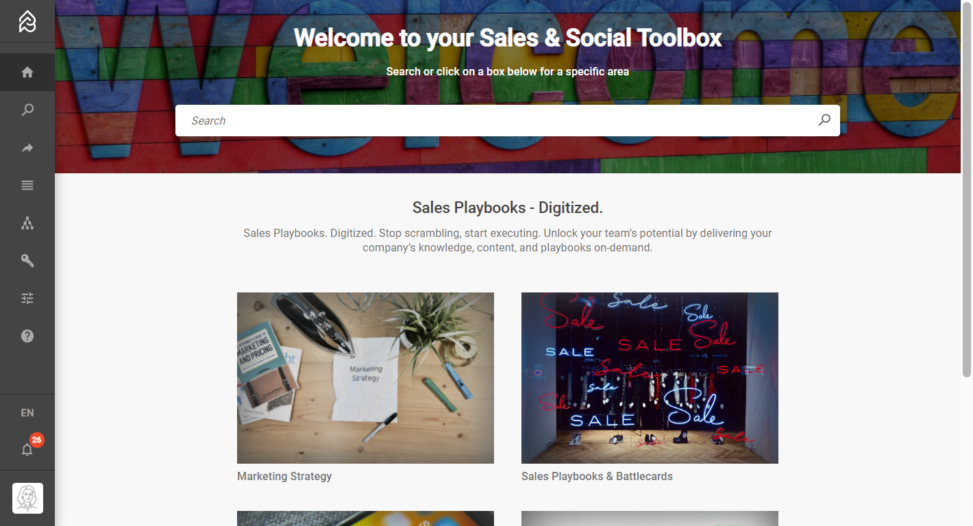
An example of a Corp Com Dashboard with a code example is below.
<!-- In the style area you can change colors and spaces. -->

<style>
    .cp-dashboard-page {
      background-color: #f8f8f8;
      position:absolute;
      width: 100%;
      height: 100%;
    }

    .banner-section {
      padding-bottom: 32px;
    }

    .teaser-section {
      display: flex;
      flex-direction: column;
      justify-content: center;
      color: #444444;
      align-items: center;
      padding-right: 16px;
      padding-left: 16px;
      padding-bottom: 32px;
      text-align: center;
    }

    .teaser-title {
      font-size: 18px;
      font-weight: 500;
    }

    .teaser-subtitle {
      color: #727272;
    }

    .cards-section {
      display: flex;
      flex-direction: row;
      flex-wrap: wrap;
      justify-content: center;
      gap: 32px;

      padding-right: 16px;
      padding-left: 16px;
      padding-bottom: 32px;
    }

    @media screen and (min-width: 600px) {
      .cards-section {
        padding-right: 10%;
        padding-left: 10%;
      }

      .teaser-section {
        padding-right: 20%;
        padding-left: 20%;
      }
    }
  </style>

<!-- Below the style area you find the predefined widgets from Picturepark.  -->


  <div class="cp-dashboard-page">
    <section class="banner-section">
      <cp-dashboard-banner
        backgroundImageUrl="https://picturepark.com/data/Releases/11.3-Rigi/CP-Dashboard-Resources/belinda-fewings-6wAGwpsXHE0-unsplash.jpg"
        teaserTitle="Welcome to your Sales & Social Toolbox"
        teaserText="Search or click on a box below for a specific area"
      >
      </cp-dashboard-banner>
    </section>
    <section class="teaser-section">
      <p class="teaser-title">
        Sales Playbooks - Digitized.
      </p>
      <p class="teaser-subtitle">
        Sales Playbooks. Digitized.
  Stop scrambling, start executing. Unlock your team’s potential by delivering your company’s knowledge, content, and playbooks on-demand.
      </p>
    </section>
    <section class="cards-section">
      <cp-dashboard-card
        imageWidth="300"
        imageHeight="200"
        title="Marketing Strategy"
        channelId="rootChannel"
        url="/contents/rootChannel"
        imageUrl="https://picturepark.com/data/Releases/11.3-Rigi/CP-Dashboard-Resources/campaign-creators-yktK2qaiVHI-unsplash.jpg"
      >
      </cp-dashboard-card>

      <cp-dashboard-card
        imageWidth="300"
        imageHeight="200"
        title="Sales Playbooks & Battlecards"
        channelId="rootChannel"
        url="/contents/rootChannel"
        imageUrl="https://picturepark.com/data/Releases/11.3-Rigi/CP-Dashboard-Resources/arno-senoner-UhvEJosq-Zo-unsplash.jpg"
      >
      </cp-dashboard-card>

      <cp-dashboard-card
        openInNewTab="true"
        imageWidth="300"
        imageHeight="200"
        title="Social Media Material"
        channelId="rootChannel"
        url="/contents/rootChannel"
        imageUrl="https://picturepark.com/data/Releases/11.3-Rigi/CP-Dashboard-Resources/adem-ay-Tk9m_HP4rgQ-unsplash.jpg"
      >
      </cp-dashboard-card>

      <cp-dashboard-card
        openInNewTab="true"
        imageWidth="300"
        imageHeight="200"
        title="Designs & Mockups"
        channelId="rootChannel"
        url="https://picturepark.com"
        imageUrl="https://picturepark.com/data/Releases/11.3-Rigi/CP-Dashboard-Resources/hal-gatewood-tZc3vjPCk-Q-unsplash.jpg"
      >
      </cp-dashboard-card>
    </section>
  </div>
You can upload all visuals for the dashboard to your Picturepark, create embeds, and update the imageUrl links in the code with the embed links.
Create or Remove Dashboard
Create
Go to Settings >Templates.
➕ Create a new template.
From the Template type drop-down list, select Dashboard page.
Select your system language first (create translations later).
Enter a name for the template.
Add HTML (see code below).
Save.
Reload the browser and find the dashboard as the first entry in Picturepark.
Delete
Go to Settings >Templates.
Find the templates with the Dashboard page template type.
Find the template in your system language (English or German).
Select the template and then select the Delete icon 🗑 (you cannot restore deleted items).
Reload the browser and find the dashboard as the first entry in Picturepark.
Modify Dashboard
You can modify the whole dashboard using HTML and CSS or work with the following predefined widgets.
Dashboard Search Box
The Search Box is an element that allows you to search for Content Items based on a search keyword. By entering a search and selecting the correct channel and search settings, a redirect to content items is performed when you search. The search box can be used by the tag cp-dashboard-search-box in the template.
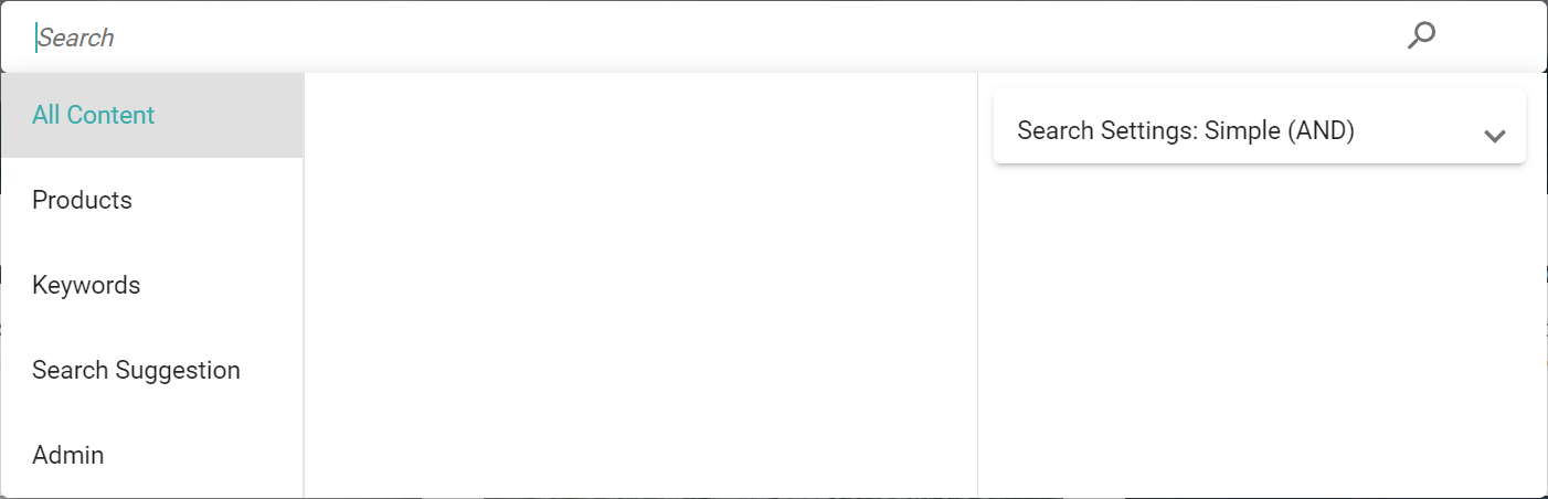
Example of a search box
Code Example
<cp-dashboard-search-box
    class="override-classes"
    [defaultSelectedIds]="['products', 'keywords']"
>
</cp-dashboard-search-box>
Configurable Attributes
Attribute Name | Required | Description |
|---|---|---|
class | ❌ | Classes that can be passed through to the internal HTML elements. |
style | ❌ | Styles that can be passed through to the internal HTML elements. |
[defaultSelectedIds] | ❌ | A string array of channel IDs to provide a preselected channel in the channel picker. If the current user has no access to any channels or the channels do not exist, the channel with the lowest sort order will be preselected. The first channel in the string array will be used if the user can access the channels. |
Override Styling
The Search Box for the dashboard is a wrapper around an internal search box implementation. The bare minimum implementation of the Search Box widget can be considered as follows:
<div class="cp-dashboard-search-box" [ngClass]="class" [style]="style">
    <INTERNAL_SEARCH_BOX_IMPLEMENTATION
      class="search-box"
      [ngClass]="class"
      [style]="style"
    >
    </INTERNAL_SEARCH_BOX_IMPLEMENTATION>
</div>
The class cp-dashboard-search-box or the class for the internal search box search-box can be extended/overridden by a class that gets passed through by the class attribute. See examples for overriding below.
.override-classes.cp-dashboard-search-box {
  // Override class cp-dashboard-search-box
}

.override-classes.cp-dashboard-search-box .search-box {
  // Override class search-box
}
Dashboard Banner
The Dashboard Banner is an element that contains a background image, title, teaser, and search box. It is preconfigured to be at least 150px and a maximum of 33% of the viewport height. The banner can be used by the cp-dashboard-banner tag in the template.
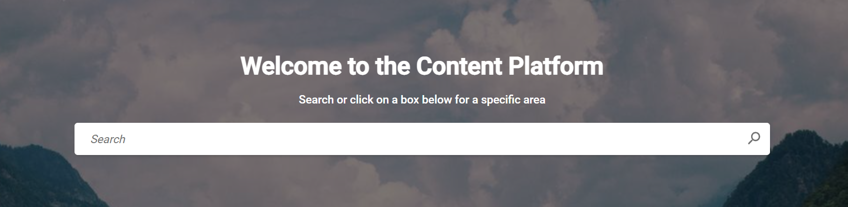
Example of a dashboard banner
Usage Example
<cp-dashboard-banner
    class="override-classes"
    backgroundImageUrl="https://picsum.photos/id/519/1920/1080"
	teaserTitle="Welcome to the Content Platform"
	teaserText="Search or click on a box below for a specific area"
	[defaultSelectedIds]="['products', 'keywords']"
>
</cp-dashboard-banner>
Configurable Attributes
Attribute Name | Required | Description |
|---|---|---|
class | ❌ | Classes that can be passed through to the internal HTML elements. |
style | ❌ | Styles that can be passed through to the internal HTML elements. |
backgroundImageUrl | ✅ | The URL of a background image. The image is being fit inside the container by CSS property |
teaserTitle | ❌ | The title of the banner. Inserted as HTML |
teaserText | ❌ | The teaser text of the banner. Inserted as HTML |
[defaultSelectedIds] | ❌ | The banner contains the Search Box widget. See the Configurable Attributes section of the Search Box. |
Override Styling
The bare minimum implementation of the Banner widget can be considered as follows:
<div class="cp-dashboard-banner" [ngClass]="class" [style]="style">
  <div class="content">
    <h1 class="teaser-title">{{ teaserTitle }}</h1>
    <p class="teaser-text">{{ teaserText }}</p>
    <cp-dashboard-search-box class="search-box" [defaultSelectedIds]="defaultSelectedIds"></cp-dashboard-search-box>
  </div>
  <img class="image" [src]="backgroundImageUrl" />
</div>
The class cp-dashboard-banner can be extended/overridden by a class that gets passed through by the class attribute. See an example of overriding below.
.override-classes.cp-dashboard-banner {
  // Override class cp-dashboard-banner
}

.override-classes.cp-dashboard-banner .teaser-title {
  // Override class teaser-title
}

.override-classes.cp-dashboard-banner .teaser-text {
  // Override class teaser-text
}

.override-classes.cp-dashboard-banner .image {
  // Override class image
}
Dashboard Cards
A Card is a combination of an image and a title that can be linked to internal resources (a predefined list view, for example) or external resources. The Card can be used by the cp-dashboard-card tag in the template.
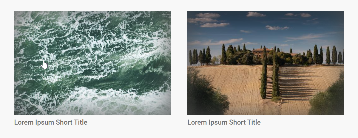
Example of two dashboard cards
Usage Example
<cp-dashboard-card
    class="override-classes"
    openInNewTab="true"
    channelId="products"
    imageWidth="300"
    imageHeight="200"
	title="Lorem Ipsum Short Title"
	url="https://picturepark.com"
	imageUrl="https://picsum.photos/seed/third/500/500"
>
</cp-dashboard-card>
Configurable Attributes
Attribute Name | Required | Description |
|---|---|---|
class | ❌ | Classes that can be passed through to the internal HTML elements. |
style | ❌ | Styles that can be passed through to the internal HTML elements. |
openInNewTab | ❌ | Defines if the provided URL should be opened in a new tab or in the same tab where the card is selected. |
channelId | ✅ | Defines whether or not to show a card based on the user's permission for the provided channel ID. The card will be shown if a user has access to the provided channel ID. Otherwise, it will not be shown. |
imageWidth | ❌ | Width for the image inside the card. Defaults to |
imageHeight | ❌ | Height for the image inside the card. Defaults to |
title | ❌ | Title for the card. |
url | ✅ | URL to which the card should be linked. If the URL starts with |
imageUrl | ✅ | URL of the image that should be displayed on the card. |
Linking to Predefined Filters
By providing the filter criteria in the URL that gets passed to the dashboard card, linking to predefined filters can be achieved. The URL that is passed to the url attribute has to start with a / and contain the full filter string.
<cp-dashboard-card
    class="override-classes"
    channelId="products"
    imageWidth="300"
    imageHeight="200"
	title="Lorem Ipsum Short Title"
	url='/contents/allContent?search=ocean&searchMode=and&sort=%5B%7B"field":"audit.modificationDate","direction":"Desc"%7D%5D&filters=%5B%7B"aggregationName":"contentType","filter":%7B"field":"contentType","term":"Video","kind":"TermFilter"%7D,"kind":"AggregationFilter"%7D,%7B"aggregationName":"audioMetadata.fileExtension","filter":%7B"field":"audioMetadata.fileExtension","term":".webm","kind":"TermFilter"%7D,"kind":"AggregationFilter"%7D%5D'
	imageUrl="https://picsum.photos/seed/third/500/500"
>
</cp-dashboard-card>Note: The filter string does not need to be serialized and can be copied from the browser URL as is.
Override Styling
The bare minimum implementation of the Card widget can be considered as follows:
<div class="cp-dashboard-card" [ngClass]="class" [style]="style">
    <a class="link">
      <div class="image-container">
        <img class="image" />
        <div class="image-shadow"></div>
      </div>
      <p class="title">{{ title }}</p>
    </a>
</div>
The cp-dashboard-card class can be extended/overridden by a class that gets passed through by the class attribute. See examples for overriding below.
.override-classes.cp-dashboard-card{
  // Override class cp-dashboard-card
}

.override-classes.cp-dashboard-card .link {
  // Override class link
}

.override-classes.cp-dashboard-card .image {
  // Override class image
}

.override-classes.cp-dashboard-card .title {
  // Override class title
}
Liquid Syntax
The Dashboard page supports the Liquid template language.
You can access the following context from within your liquid template: { isAnonymousUser: bool, userRoleIds: string[], userRights: UserRight[], isDeveloper: bool, loginUrl: string, customer: { customerId: string, name: string }
Example for checking user rights
{% if userRights contains "ManageSharings" and userRights contains "ManageEmbeds" %}
    <cp-dashboard-card
      channelId="keywords"
      imageWidth="250"
      imageHeight="200"
      title="Shares Page that will show only Embeds"
      url='/shares?sort=%5B%7B"field":"audit.creationDate","direction":"Desc"%7D%5D&searchMode=and&filters=%5B%7B"aggregationName":"ShareType","filter":%7B"field":"shareType","term":"Embed","kind":"TermFilter"%7D,"kind":"AggregationFilter"%7D%5D'
      imageUrl="https://images.unsplash.com/photo-1560007689-654552332adf"
    >
    </cp-dashboard-card>
    {% endif %}
Example for checking user role IDs
{% if userRoleIds contains 'bc0f6581b236497fbddf3ff67bfd2459' %}
  <section class="cards-section">
    <cp-dashboard-card
      channelId="keywords"
      openInNewTab="true"
      imageWidth="300"
      imageHeight="200"
      title="Picturepark Website"
      url="https://picturepark.com"
      imageUrl="https://picturepark.com/data/System/KEI-Automated-Testing-DO-NOT-DELETE/picturepark.png"
    >
    </cp-dashboard-card>
  </section>
  {% endif %}
Guest Portal Access
When using the Guest Portal feature, you can customize the text displayed when accessing the dashboard.
Usage Example
{% if isAnonymousUser %}
      <p class="teaser-title">
        You are accessing the public area of this Picturepark <a href="{{loginUrl}}">Login</a> to get full access!
      </p>
{% endif %}